when Ryan Watt, the Executive Director at Indie Memphis, reached out to us to put together the creative for their 2017 film festival, we knew immediately it was right in our wheelhouse. A consumer facing multimedia campaign with loads of opportunity to flex our collective creative muscles was too good to pass up. Add to that it’s the 20th anniversary of the festival and the godfather of Memphis branding, Trace Hallowell, would be designing the new Indie Memphis logo to include in the creative, we started getting a little excited.
Our initial meeting revealed that we needed to be very deliberate with the messaging. The audience needed get the message quickly, so the creative pretty much needed to scream “FILM FESTIVAL”. That may seem obvious, but when you’re putting together creative for a 20 year old event and you’re trying to be clever while trying not to cover the same ground as years past, it’s easy to unwittingly bury the message.
Identifying your audience is always important, and sometimes a challenge. While attracting out-of-towners was certainly a priority, sparking interest locally needed to be the primary focus. And how do you market locally without covering that dreaded aforementioned “same ground”? Every project begins with trying to come up with something that hasn’t been done before. Something other than the tired old “Blues, Barbecue, and…”. you know the drill. But then we thought, why not take the path of least resistance and just embrace those established stereotypically “Memphis” things and give them new life in a unique way?
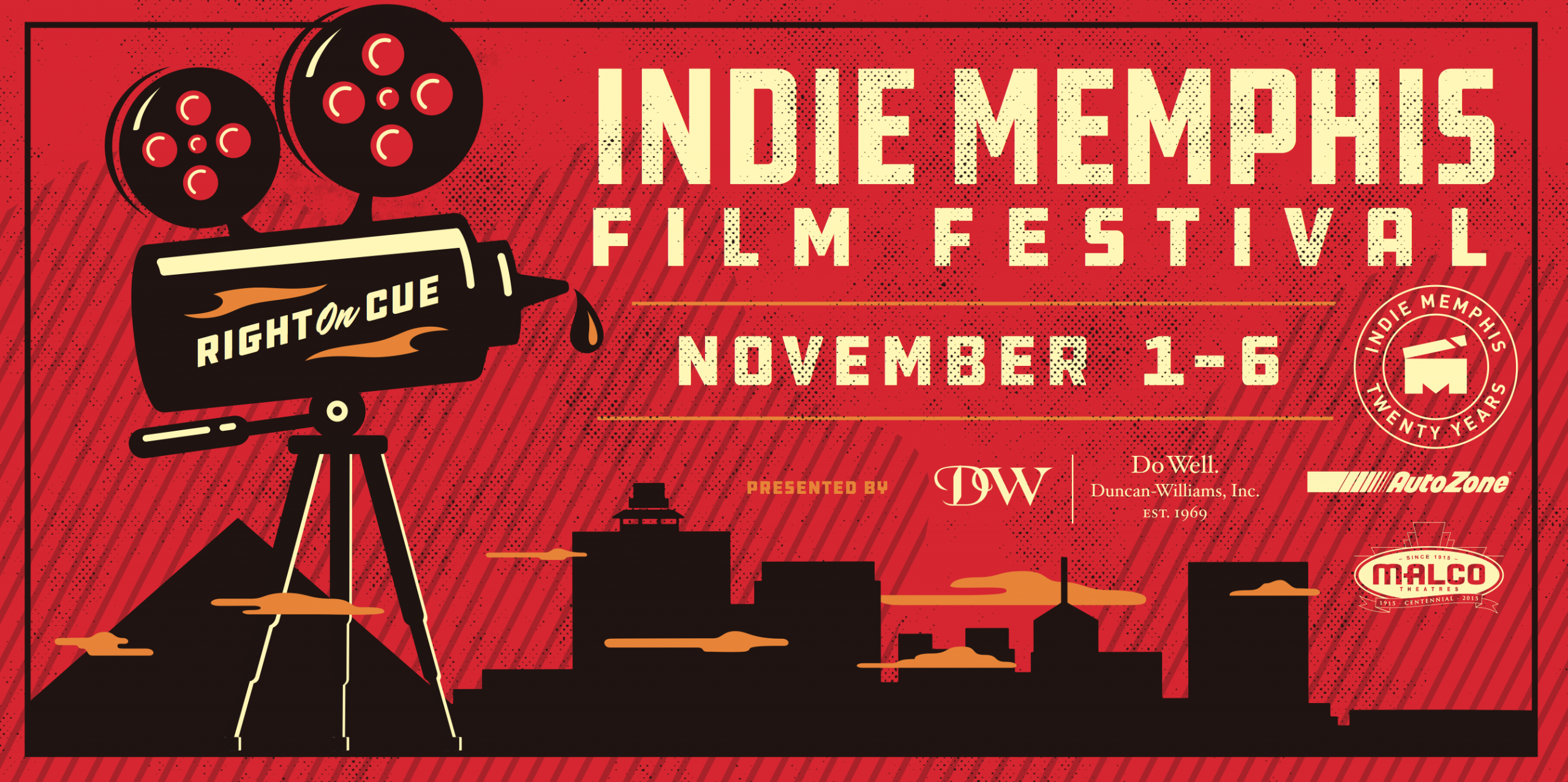
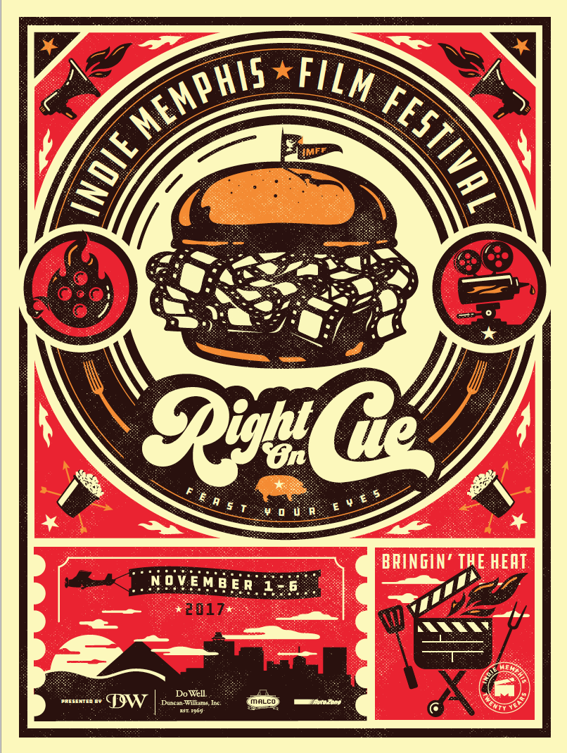
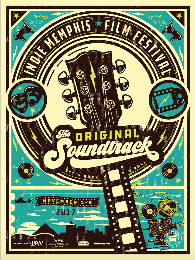
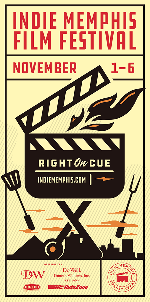
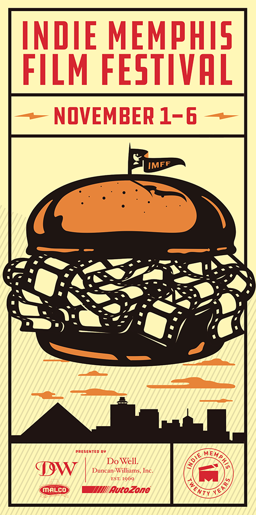
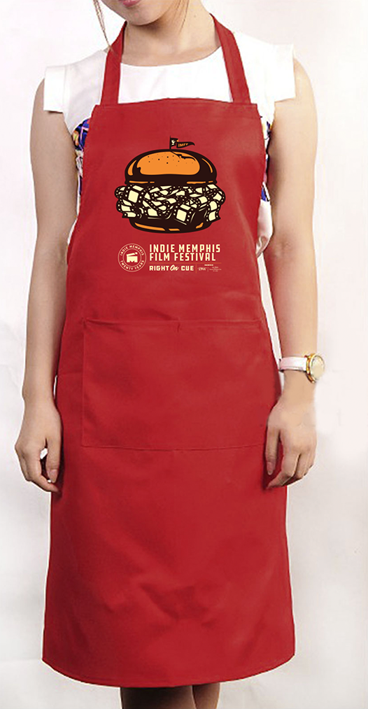
The tagline “Right On Cue”, with the obvious double entendre, popped immediately, as did the visual of the traditional pulled pork sandwich piled high with film instead of meat. And because two concepts is always better than one, we came up with “Rockin And Rollin” and the accompanying visual of the guitar neck with a film strip in place of the frets. Now we had two pretty clever double meaning taglines that helped to conjure up some really interesting visuals.
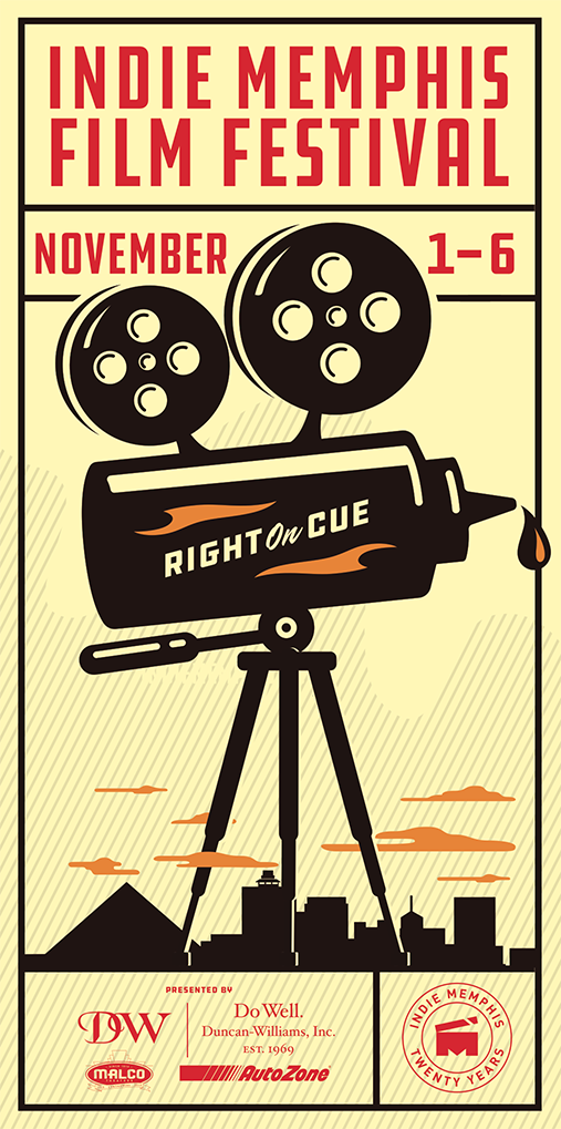
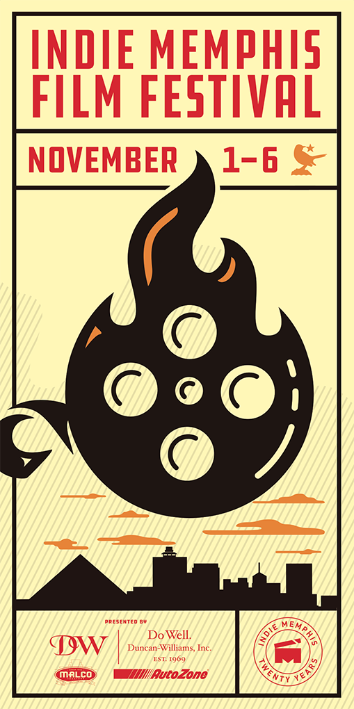
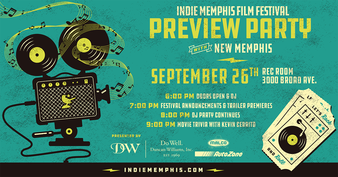
From a conceptual standpoint I wanted to continue the film/barbecue – film/music “mash-up” we established with the sandwich and the guitar so I came up with as many as I could from both motifs. What resulted was some pretty cool and unexpected imagery. The real challenge was illustrating these mashed up visuals in a style that would enable them to also be quick reads on a billboard or in a shop window. Understanding that a BBQ sauce bottle topped with film reels mounted on a camera tripod might be a challenge for the average person to decipher in a few seconds, we decided to use a flat minimal illustrative style along with a bold limited color palette, keeping only the essential design elements needed to communicate the message.
The resulting campaign is a diverse array of images and clever copy that is both eye-catching and unique. And, most importantly, delivers the message both quickly and memorably while touting the two most “Memphis” things of all. Here’s hoping this campaign will help Indie Memphis add film to that list.
